crypto
·Bloomberg, 2026
Prediction Markets Are Minting a New Type of Insider Trader
Sites like Polymarket were built to price uncertainty. New data shows they might be rewarding privileged knowledge instead.
crypto
·Bloomberg, 2026
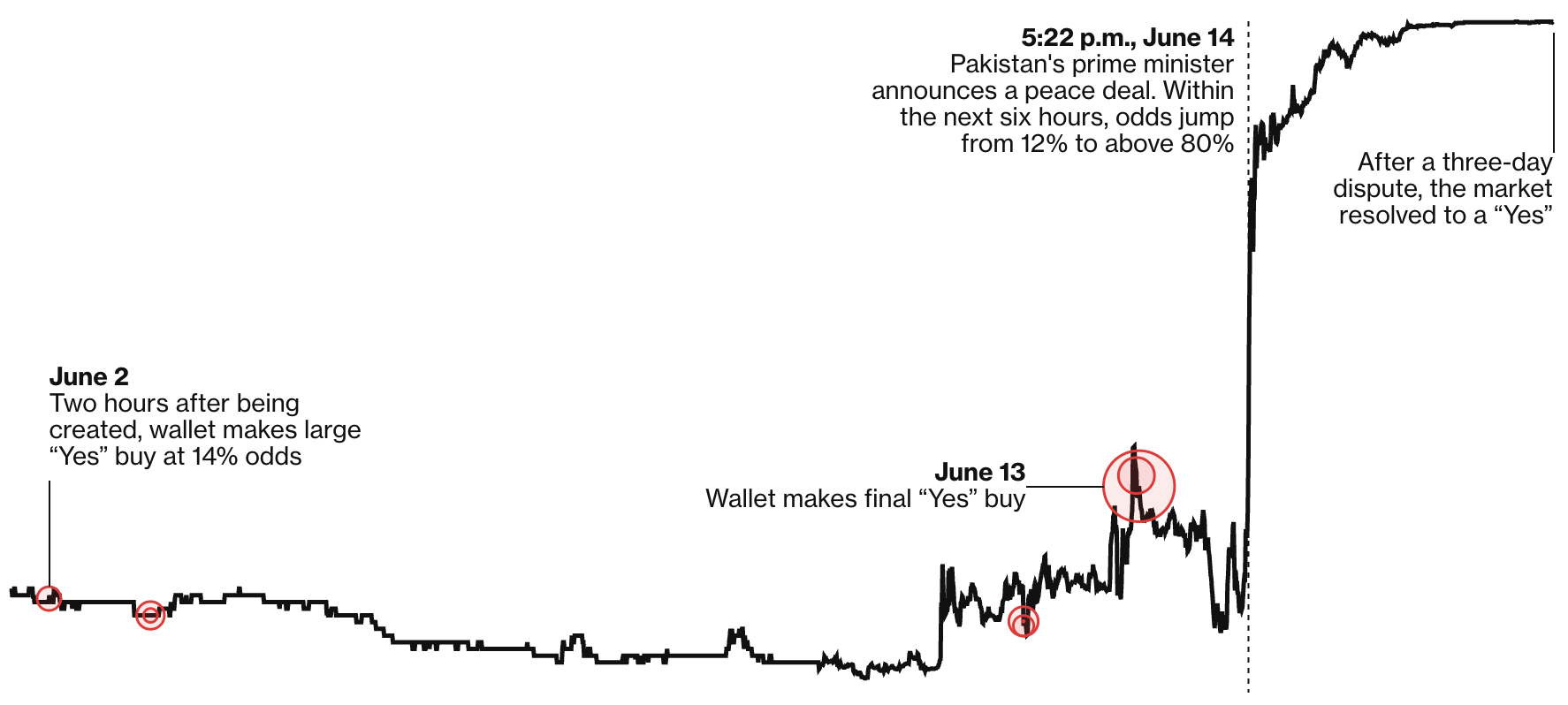
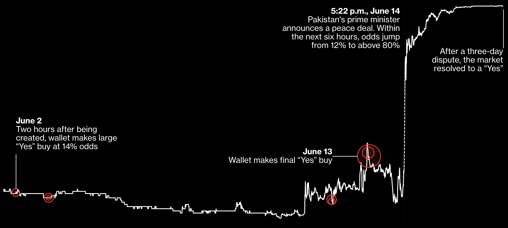
Polymarket Bets on Iran Deal Fuel Fresh Insider-Trading Fears
A Bloomberg analysis of several well-timed Polymarket bets with outsized profits reveals the risk of insider trading
technology
·Bloomberg, 2023
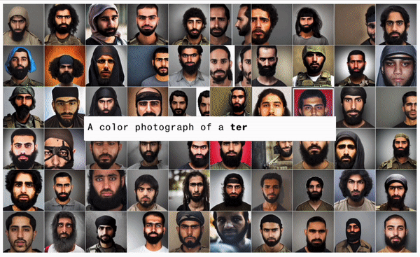
Humans Are Biased. Generative AI is Even Worse.
Stable Diffusion's text-to-image model amplifies stereotypes about race and gender - here's why that matters


technology
·Bloomberg, 2025
AI Data Centers Are Sending Power Bills Soaring
Wholesale electricity costs as much as 267% more than it did five years ago in areas near data centers. That’s being passed on to customers.

technology
·Bloomberg, 2025
AI Is Draining Water From the Areas That Need It Most
More than 160 new AI data centers have been built across the US in the past three years in regions already grappling with scarce water resources, a Bloomberg News analysis finds.
technology
·Bloomberg, 2024
AI Needs So Much Power, It's Making Yours Worse
An analysis of ~800K sensors that found a strong link between proximity to AI data centers and distorted power in residential homes.
technology
·Bloomberg, 2025
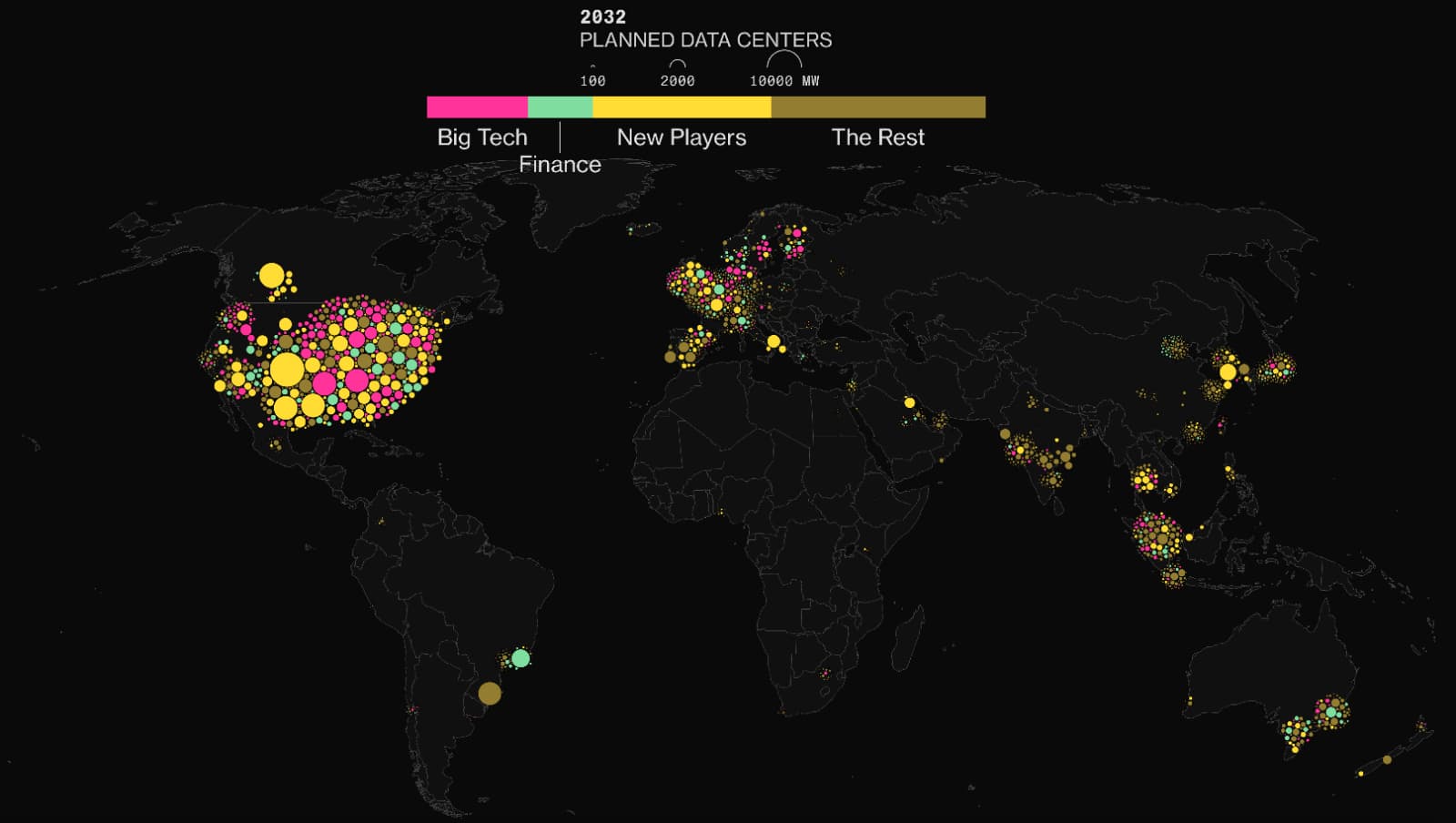
AI Data Center Gold Rush Driven by Thousands of Newcomers
Big Tech’s dominance of AI infrastructure is shrinking as a host of other players pile into the arena — with global economic consequences.

technology
·Bloomberg, 2024
AI Is Already Wreaking Havoc On Global Power Systems
A data investigation into 1000s of data centers which found that AI data centers are coming online so fast that electricity demand is straining global power grids and threatening clean energy goals.
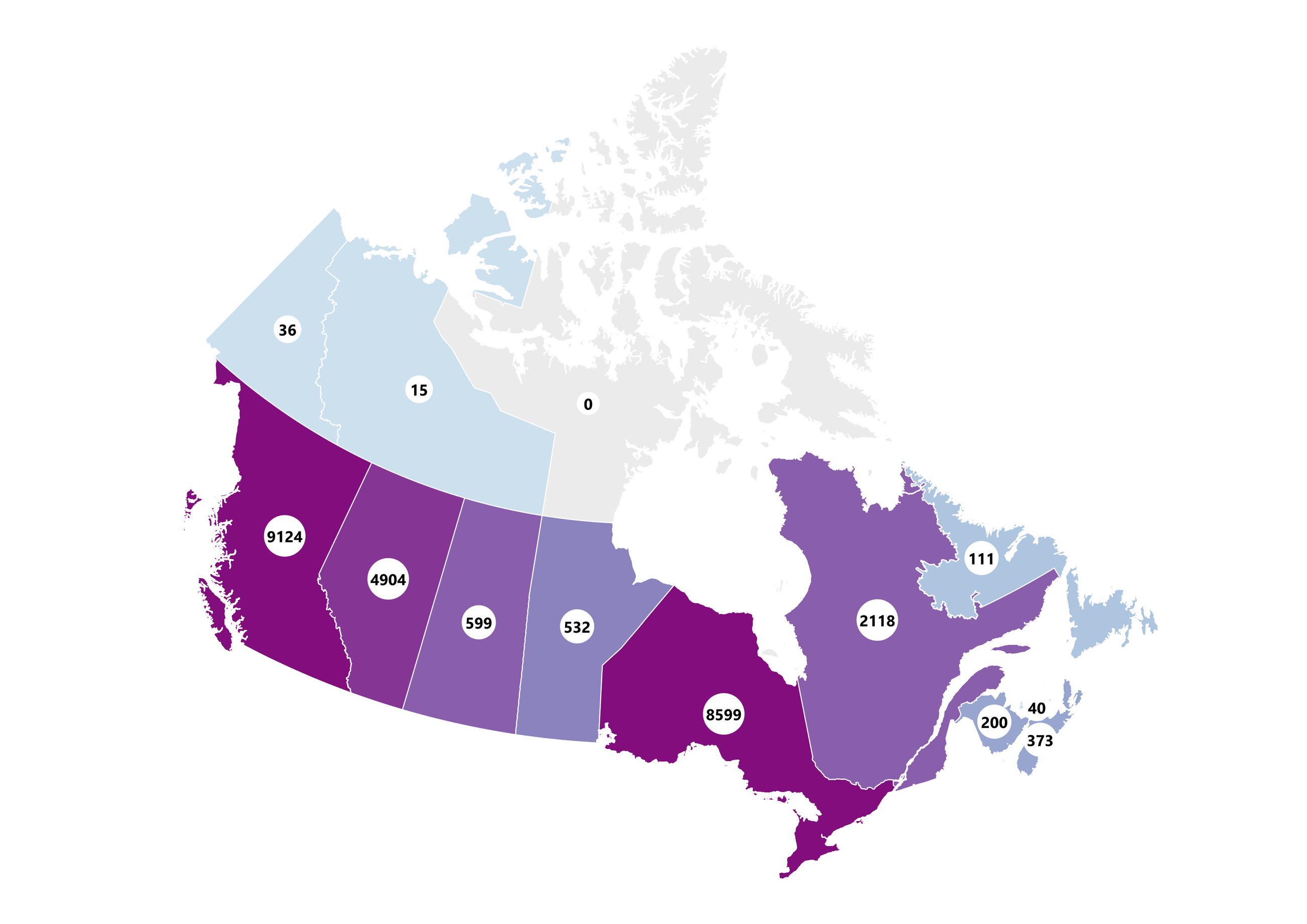
crypto
·Bloomberg, 2025
Top Trump Crypto Buyers Vying for Dinner Seats Are Likely Foreign, Data Shows
The majority of top holders of Donald Trump’s memecoin have used foreign exchanges that say they ban US users, suggesting many purchasers are based abroad
technology
·Bloomberg, 2024
Elon Musk Is Now X’s Biggest Promoter of Anti-Immigrant Conspiracies
The billionaire owner is spreading debunked theories of undocumented voters swaying the US election, and growing his influence in the process

technology
·Bloomberg, 2024
“Remigration” — How a White Nationalist Threat Spread From Austria to the US
An analysis of 3.1M social media posts, revealing the growing influence of European extremists global politics
technology
·Bloomberg, 2024
OpenAI's GPT Is a Recruiter’s Dream Tool. Tests Show There’s Racial Bias
Recruiters are eager to use generative AI, but a Bloomberg analysis found bias against candidates based on their names alone.
politics
·2022
The Most Dangerous U.S. States to Reside in
A Tool Designed with Female Assigned at Birth (AFAB) and Femme Folx' Safety in Mind

gender
·The Pudding, 2022
When Women Make Headlines
Analyzing more than 382,000 headlines to see how women are represented (or misrepresented) in the news.